Goodbumps
Project Year:
2023
Business Size:
Pre-Seed Startup
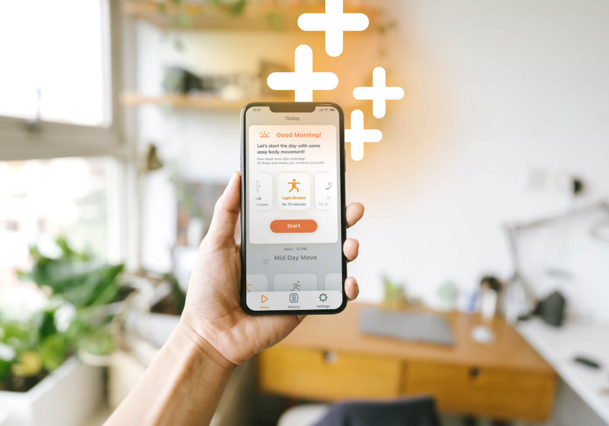
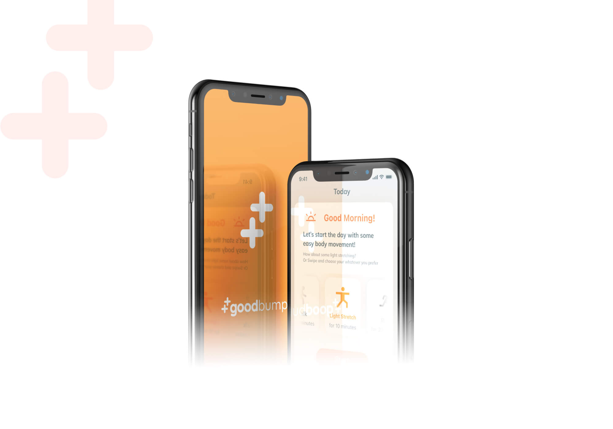
Goodbumps is an iOS app that helps users improve their mood and overall well-being through regular exercise.
With a variety of exercise options and personalized reminders, Goodbumps makes it easy for users to establish a consistent routine and track their progress.
By logging mood before and after each exercise, users can visualize the positive impact of their workout and stay motivated to make exercise a regular part of their routine.
In a crowded market of exercise apps, it was important to create a branding identity that would capture users' attention and be instantly recognizable.
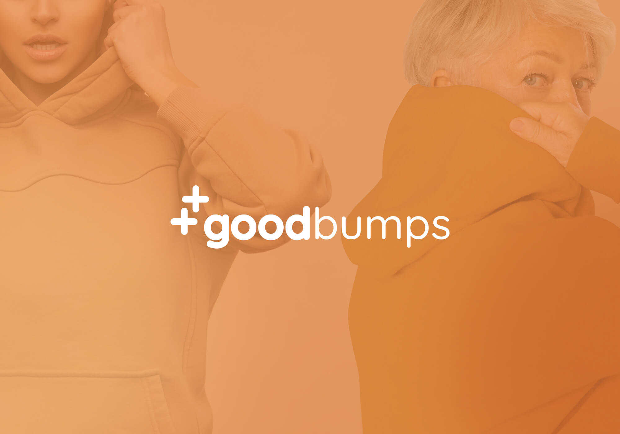
With a humorous name, the branding needed to be funny and fresh, modern and approachable, while still working for a wide age range.
Through the use of a simple and playful design, the result is an identity that is both unique and memorable.
With a tight deadline to deliver and start collecting user signups, we were thrilled to see over 200 users sign up in record time.
- Brand Identity
- Logo Design
- Styleguide
- Imagery Guide
- Social Media Templates
- Screen UI Design
Brand Discovery
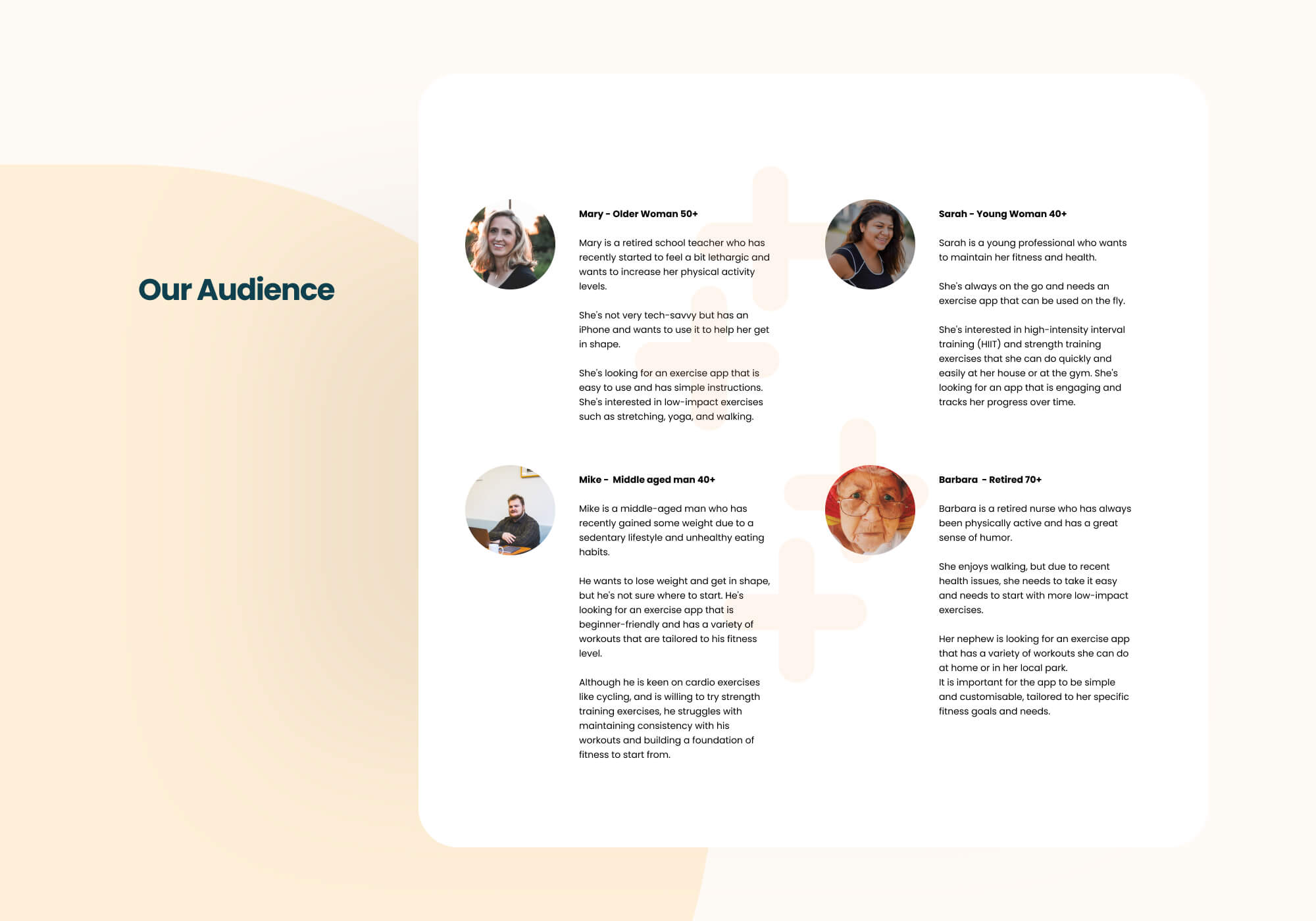
The discovery process involved outlining various user personas representing different segments of potential users with unique backgrounds, fitness levels and exercise goals.
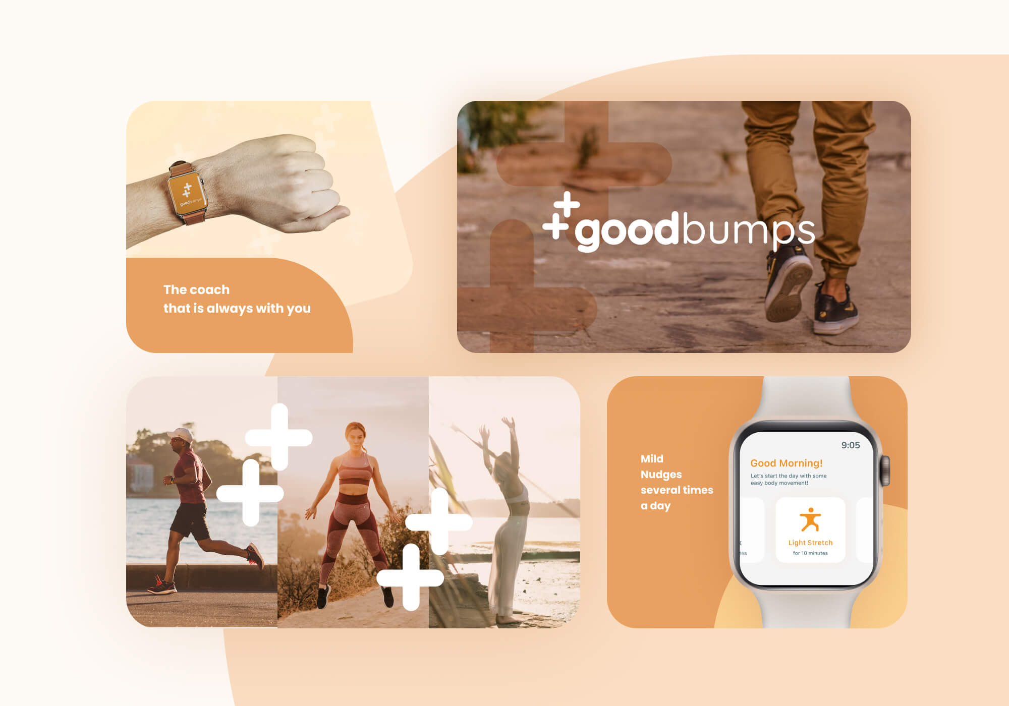
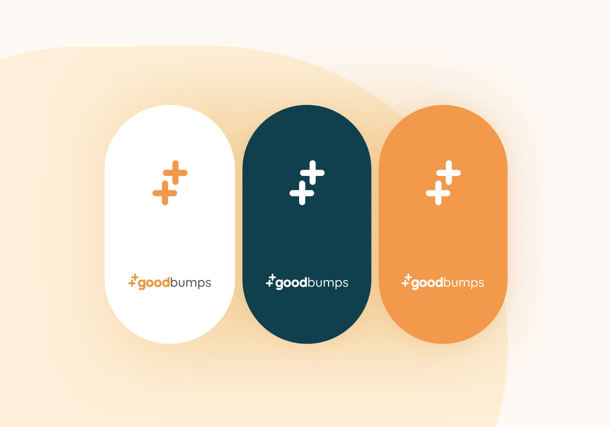
Symbol Design
The plus sign was chosen as a brand symbol for the exercise app due to its positive association with self-improvement and upward motion, creating a dynamic and energetic image.
The double plus symbol, or "bump," also represents a way to "bump up" your mood through exercise, making it a fitting choice for the app's focus on well-being.
The rounded edges of the plus sign add to the sense of approachability and friendliness of the brand.
Logo
Styleguide
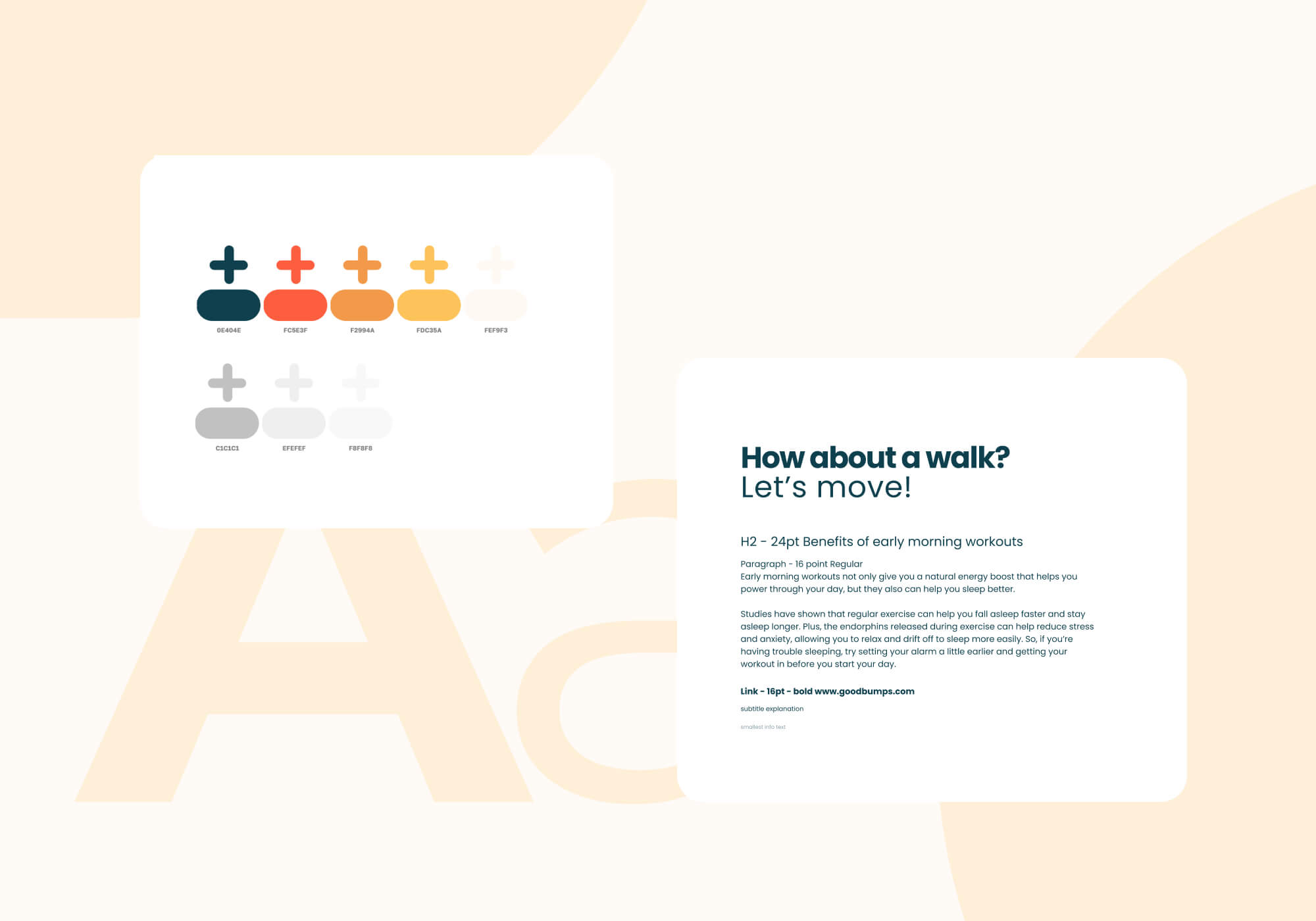
Colors
During the design we considered various color schemes before ultimately deciding on a combination of orange and gold yellow with a light base.
These colors were selected for their warmth and radiance.
By using these colors the aim was to create a visual atmosphere that would encourage users to feel positive and energized about their workout, ultimately helping them stay consistent and build a long lasting routine.
Typography
We opted for a sans serif, clean, and minimal typeface that also featured round edges.
its simplicity and readability makes it easy for users to quickly scan and understand the app's content, which is especially important during physical activity.
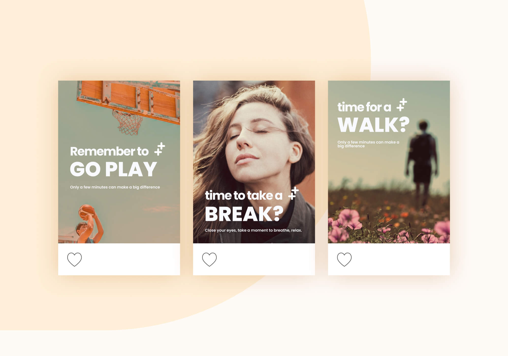
Social Media
Branding applied,
app mockup
Branding applied,
app mockup