Flojo
Project Year:
2023
Business Size:
Startup
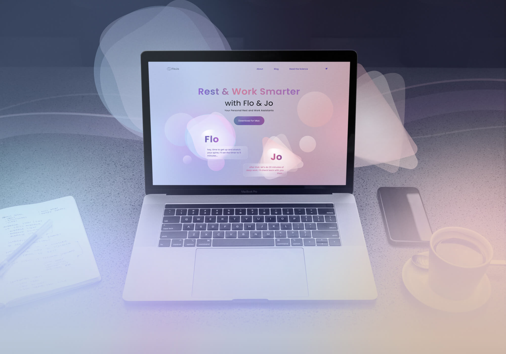
Our goal was to create an identity for a timer that people would love to use.
Most timers are functional but very boring, so we wanted to come up with a concept that would make it more interesting and fun.
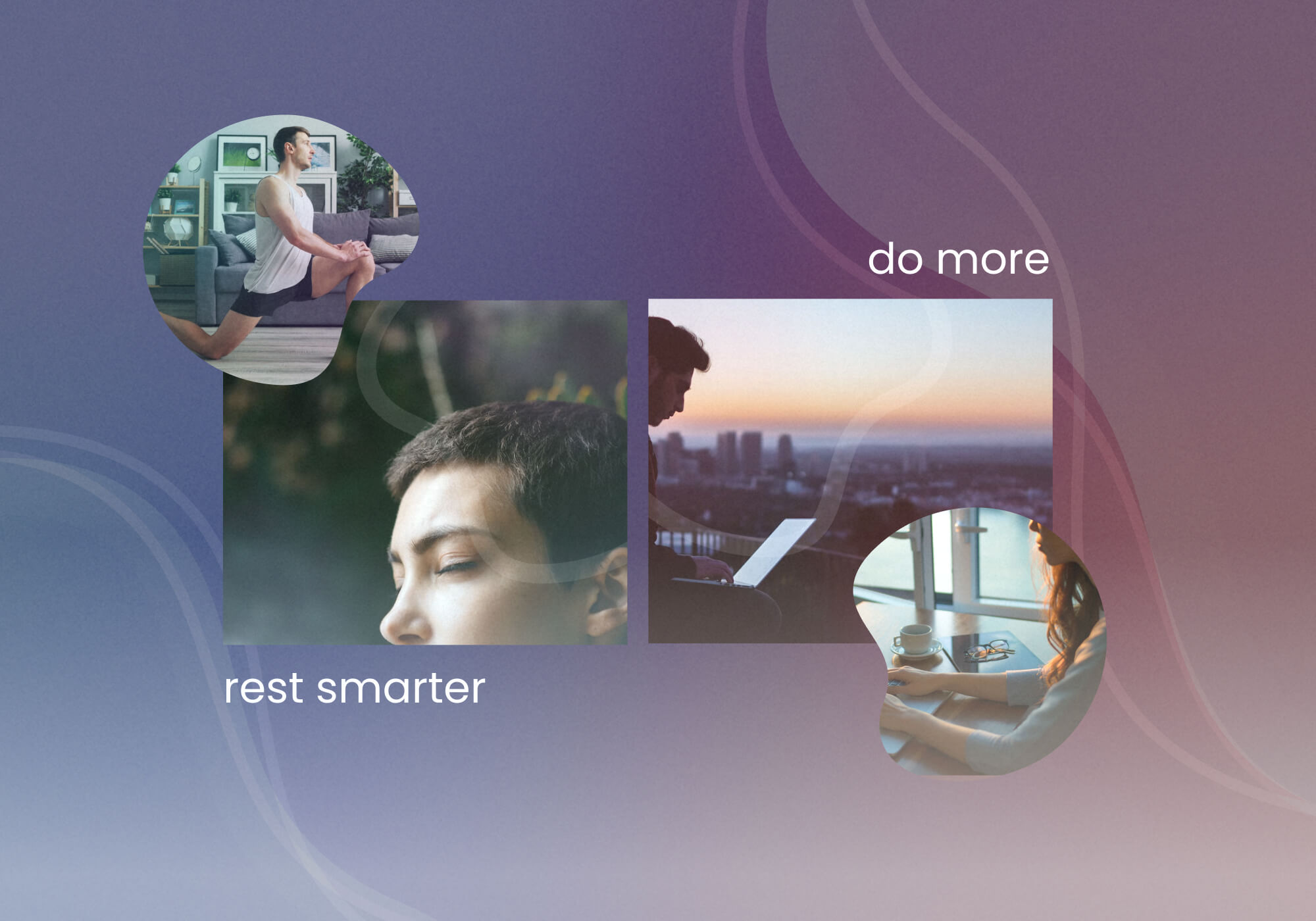
We also wanted to represent the two sides of working – the focused, productive side, and the relaxed, restful side – in a visually compelling manner.
Our job was to make space for both and capture the dynamic between the two.
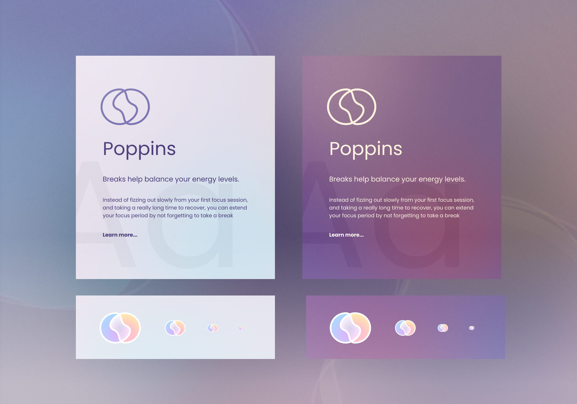
- Brand Identity
- Logo Design
- Styleguide
- Web Concept
- Imagery Guide
Logo
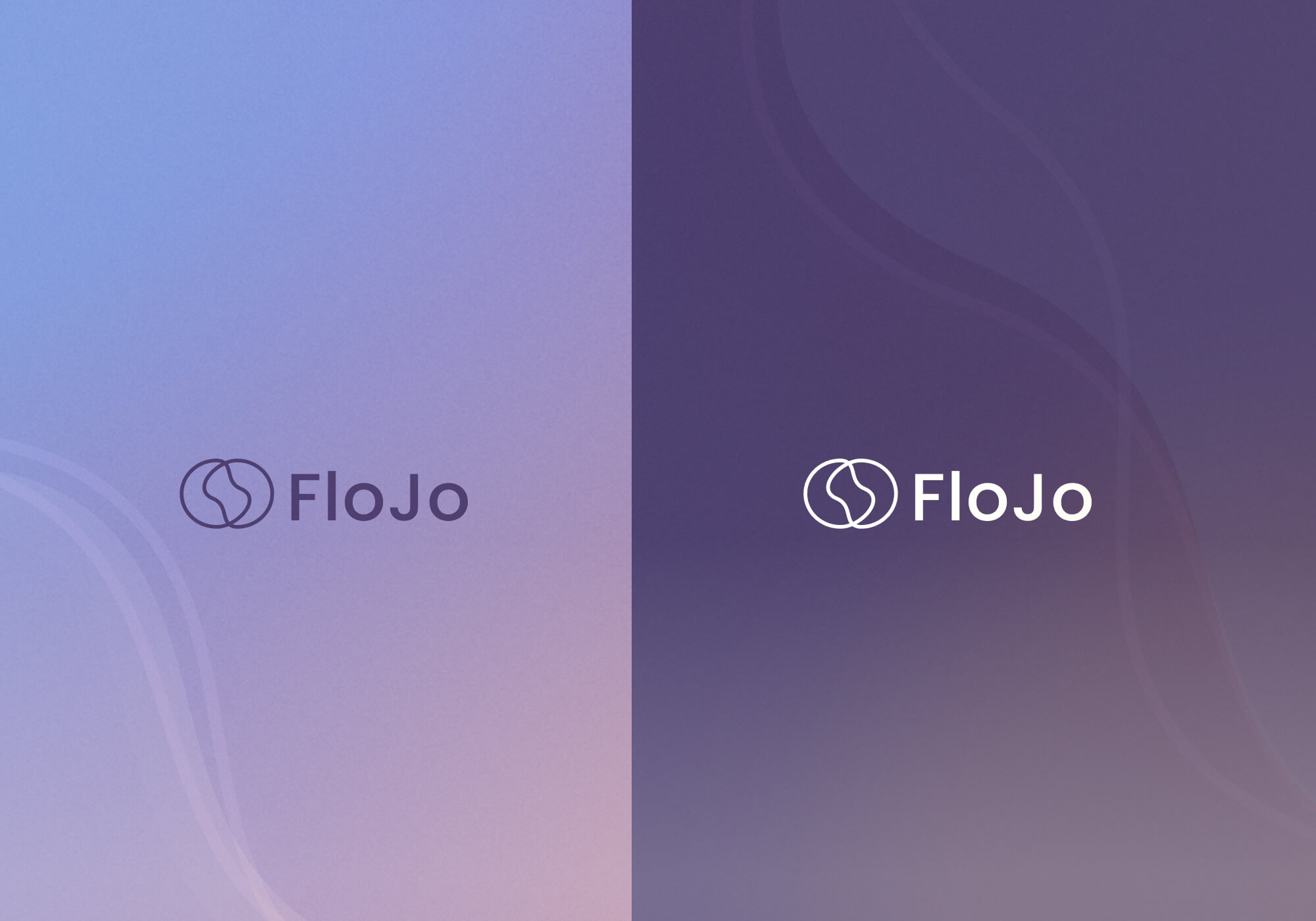
Typography and App Icons
Characters:
the calm Flo and the more active Jo.
We wanted to represent the two sides of working – the focused, productive side, and the relaxed, restful side – in a visually compelling manner.
To achieve this, we listed emotions people experience while working.
Based on this, we conceptualized two characters to represent the two moods, each with their own unique personality.
The characters were deliberately left vague, to allow users to project their own thoughts and feelings onto them.
One character represented the focused, productive side, while the other represented the relaxed, restful side.
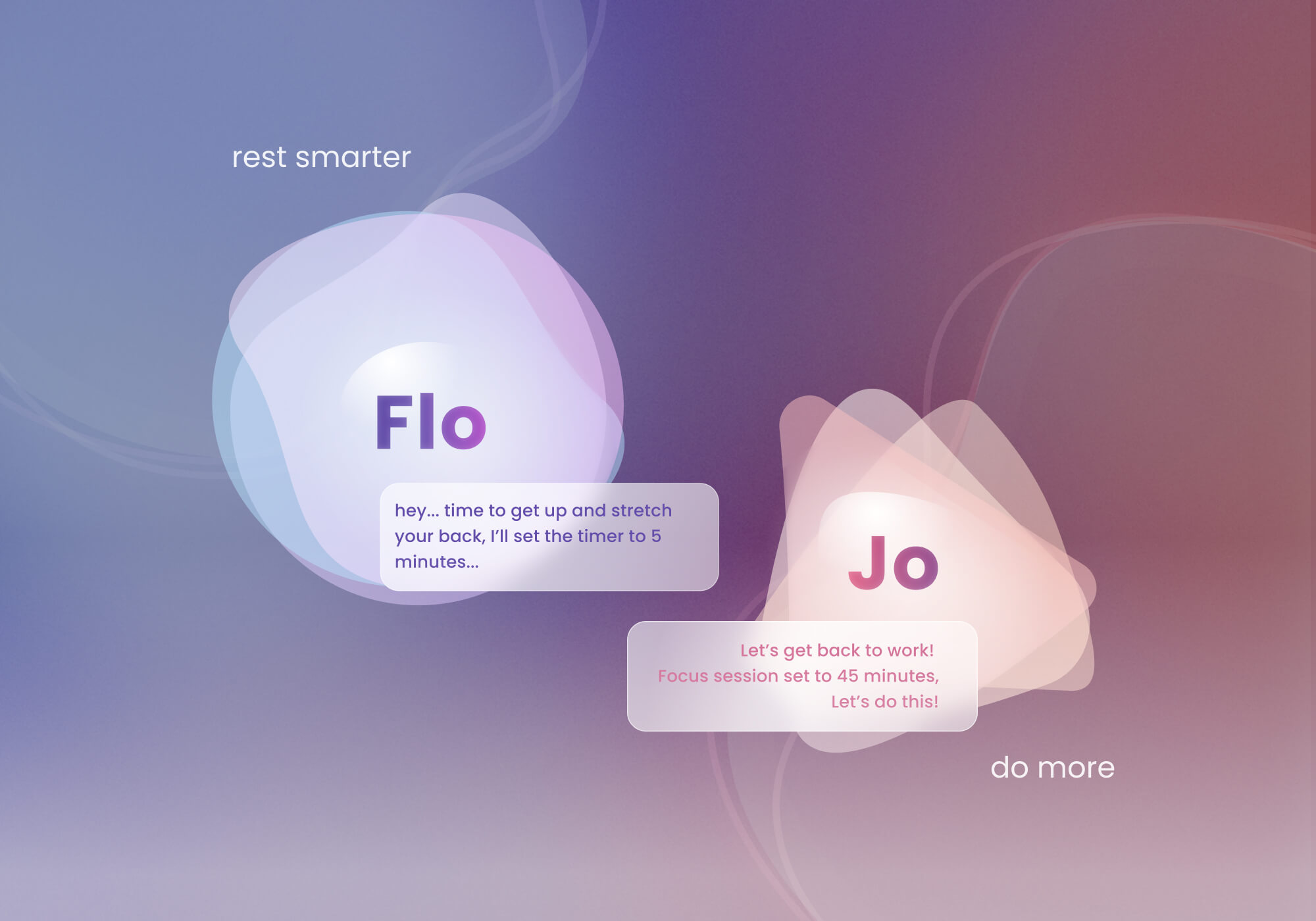
"rest more - do more"
campaign concept and imagery guide
Website
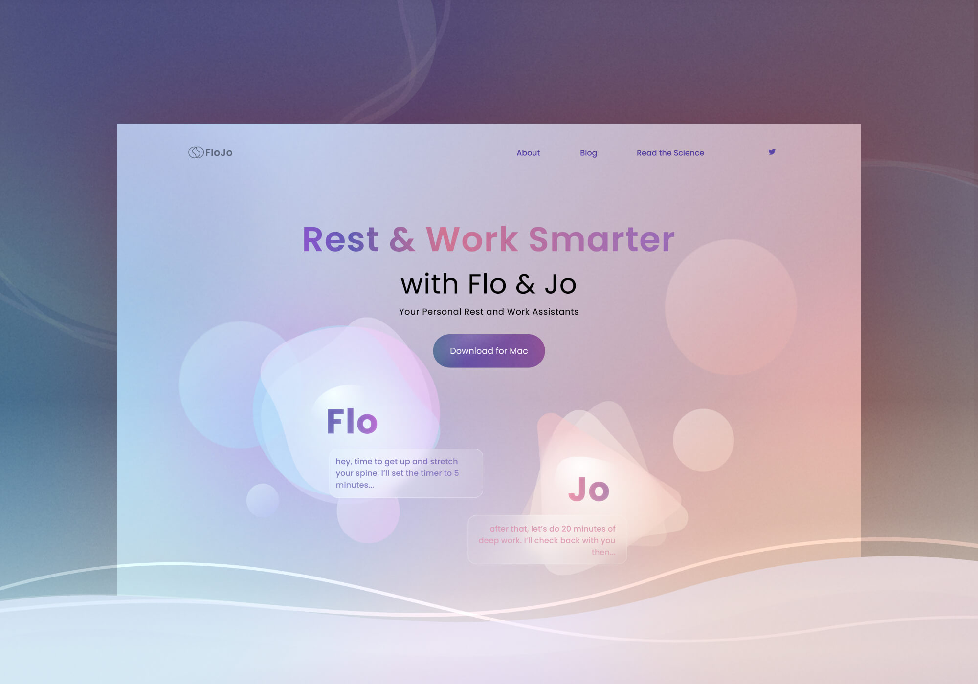
Website